TimeWall – A Plan & UI to Innovate the Twitter Timeline
As discussed with my buddies here’s a plan that could help Twitter revitalize and make it more relevant to many more users.
Twitter’s core asset is the realtime ephemeral nature of the product. Twitter is the platform that topples governments, after all.
However, that same ephemeral nature of the product also stunts its growth. For example, there is no good way for new users to browse the historical record and see what makes Twitter so great and why they should care.
The complaint I get from people when I talk to them about Twitter is “there is no context” it’s “too hard to get into”.
Time
So what makes Twitter different from other social networks? In my opinion it’s the realtime, breaking news nature of the product. No other social network offers that feature quite so well as Twitter does.
But what I’ve been wondering is, since time is such a core component of Twitter, then why is it paid so little attention in the UI.
And since we’re talking about time… In the general human experience, is time vertical or horizontal? I would argue that time is generally experienced as a horizontal phenomenon.
For time to exist, we need to travel through space, and in most instances that is a horizontal experience. In cars, planes, trains, etc.
Thinking about time as a horizontal, rather than vertical, is not new idea to software. Consider all the audio and video editing software that for the most part renders time as horizontal artifacts.
Scrubbing & Time Zoom
One of the great features of audio and video editing software is the ability to easily grab and timescrub the timeline backward and forwards. Coupled with the ability to zoom in and out to different time resolutions it makes it really easy to navigate around the timeline to the parts you are interested in.
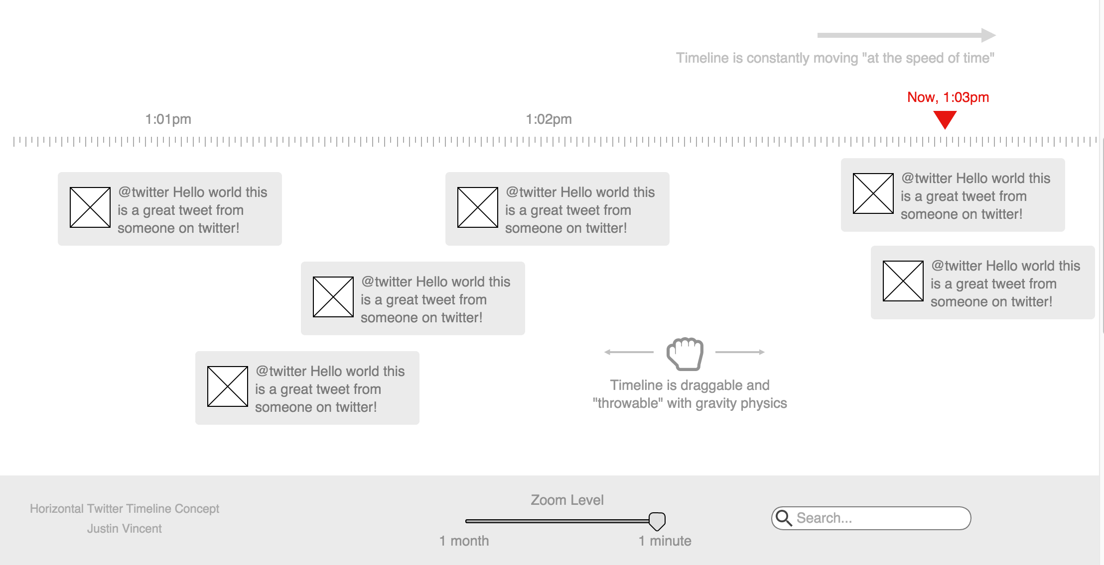
TimeWall
(Click to zoom in)
Putting this all together it’s not hard to visualize a new way of using Twitter. A TimeWall that is constantly moving sideways “at the speed of time”.
With the ability to timescrub the conversation by throwing it left and right. Also with the ability to zoom-in and out to minutes, hours, days, months, years.
When zoomed to a time resolution the ui and backend simply highlight the most important conversations of that time frame.
Think Minority Report.
Links to Time
This new TimeWall would give users the ability to deep link to “an event in time” and would unlock all of Twitter’s archived content.
Furthermore, Twitter would finally have the ability to have “long term content”. This would be much more friendly for new users who could fully explore Twitter using the new timescrubbing and zoom features.
Long term content could also increases Twitter’s Google SEO surface area. Which means the content is a much bigger fly trap and more people will see twitter content in search results more often.
Mobile
Although the full TimeWall is not appropriate for phones in portrait more, the time scrubbing tool and time resolution zoom in/out tool still work as a core navigation tool, even with a regular vertical tweet list.
Of course, for many mobile devices in landscape mode, there would be no issue.
Conclusion
Obviously, this is just a start, but with more thought and iterations from Twitter’s core ui & ux teams there’s a ton of utility that could be unlocked here. CRO experts such as Conversion Team could help refine the user experience further by analyzing user behavior, optimizing design elements, and testing different strategies to maximize conversions and user engagement.
Who know’s, this might even start a Twitter revolution 😉
For further discussion see Hacker News.

